
Stylesheet: Text / Buttons / Headings
Page Settings
You can select a Site Theme through the drop-down that will affect all content areas below. Site Themes are applied through the page templates and are not generally adjustable per page.
Headings
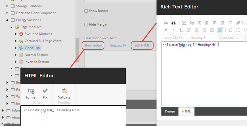
Headings are styled via a specific set of classes rather than on the heading tags themselves (H1, H2, etc.). In general, headings will be styled automatically by the page and content components, but the classes can be used within Rich Text Editor fields to add the heading styles.
-
H1
Class: hdg hdg_1
Tag: h1
Main Title
-
H2 - Heading 2
Class: hdg hdg_2
Tag: h2
Page Section
-
H3
Class: hdg hdg_3
Tag: h3
List Heading
-
H4
Class: hdg hdg_4
Tag: h4
Item Heading
-
H3 - Guide
Class: hdg hdg_3 mix-hdg_guide
Tag: h3
Guide
-
H3 - Heavy
Class: hdg hdg_3 mix-hdg_heavy
Tag: h3
Heavy
-
H3 - Reverse
Class: hdg hdg_3 mix-hdg_rev
Tag: h3
Reverse
-
H3 - Underline
Class: hdg hdg_3 mix-hdg_underline
Tag: h3
Underline
Base Buttons
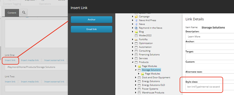
Default button styling is added via the btn class. Most components will add this class to links and CTAs automatically. It can be added manually to any Link field using the Style class field or to any anchor/button tag directly on the class attribute (via a Rich Text Editor)
-
Secondary Button
Class: btn btn_secondary
Tag: button
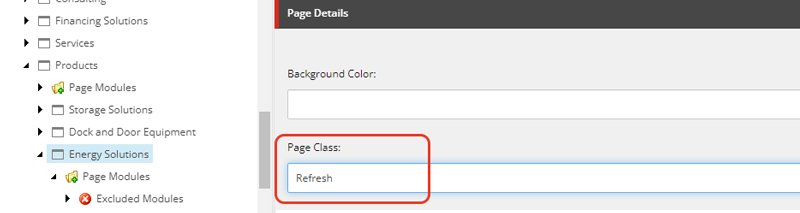
Refresh Buttons
The Raymond Refresh styling is added by applying the Refresh Page Class on the page itself. When applied, it adjusts the default button styling as well as enabling styling by the type of link. The linkType classes are added automatically by certain components, and can be added manually. They will not have an effect without the Refresh page class.
-
Button - Media Link
Class: btn linkTypeMedia
Tag: button
Icons
Icons are added using an icon font created and updated as needed by Emergent. The icons can be added to links or buttons using an "ico-" class within the link settings in the Style Class field. They can also be added manually within Rich Text Editors as class items on anchor or button tags.